🌙 Luaniü Website Redesign
Redesign and development of an eco-friendly feminine hygiene brand's website
👩🏻💻 Overview
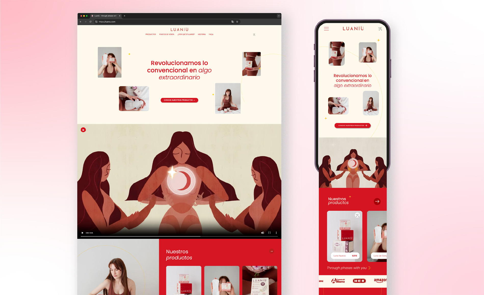
Luaniü creates eco-friendly feminine hygiene products with a brand identity inspired by moon cycles and natural femininity. I led a full redesign outside Shopify’s theme system designing and hand-coding a new site in HTML, CSS, and JavaScript, deployed on external hosting, while keeping Shopify as the secure checkout and product backend.
🧩 Challenge
Luaniü’s previous website didn’t reflect the brand’s care or values. The visual design felt inconsistent, buttons came in different styles, there were too many links in the navigation bar, and the typography lacked hierarchy. The result was a confusing experience that made exploring and purchasing products complicated. It took several clicks to reach a product and even more to complete a purchase. The mobile version was especially problematic because there wasn’t a responsive layout, elements would shift and overlap.
Accessibility was another major concern. Some text was too small to read, color contrasts were off.
There were also technical constraints: the redesign had to move outside Shopify while keeping Shopify as the checkout system. This meant rebuilding a new, fully custom site in HTML, CSS, and JavaScript, while ensuring that the purchasing process still worked seamlessly.
Ultimately, the main challenge was to transform a disorganized, difficult-to-navigate website into a cohesive, intuitive, and visually aligned experience that truly represented Luaniü’s identity and made purchasing effortless for users.
✨ The Solution
Goals
The redesign aimed to create a website that feels clean, intuitive, and true to Luaniü’s values—an experience that communicates softness, trust, and care while making products easy to find and purchase. The redesign focused on achieving three key goals:
Simplify navigation and reduce friction in the purchasing journey
Create a consistent visual system with clear hierarchy and accessible typography
Strengthen the consumer’s trust and emotional connection through a reliable experience
Approach
I began with a full audit of the old site to identify usability pain points and visual inconsistencies, then redesigned the interface and components for clarity, responsiveness, and cohesion across devices.
I rebuilt the front end from scratch using HTML, CSS, and JavaScript, keeping Shopify as the checkout system. This preserved e-commerce functionality while delivering a smoother, faster, and more consistent experience.
✏️ Design Process
I approached this project with a comprehensive UX methodology, handling every aspect from research to implementation:
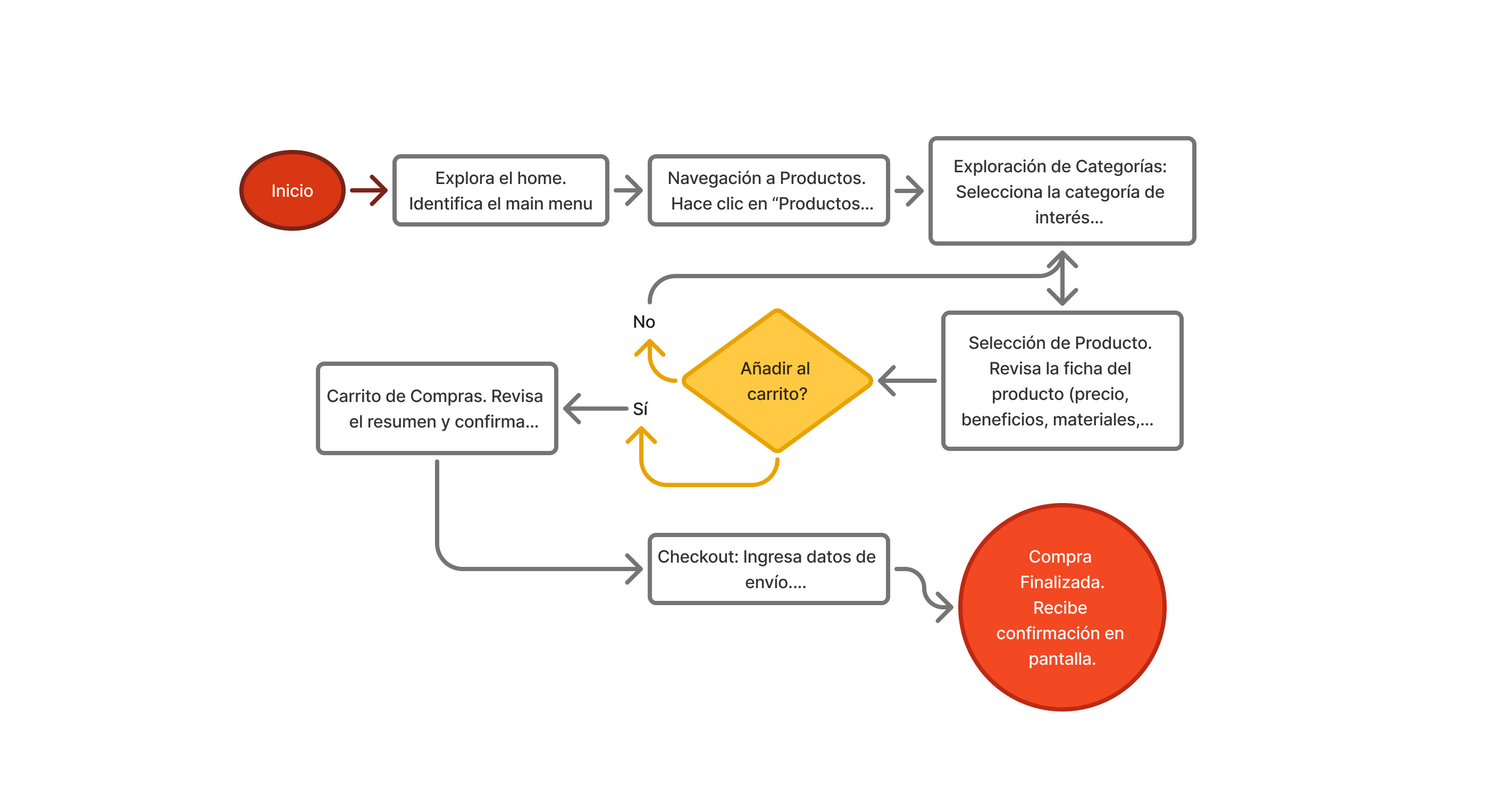
User Flow Design
Created streamlined paths from discovery to purchase, reducing friction points
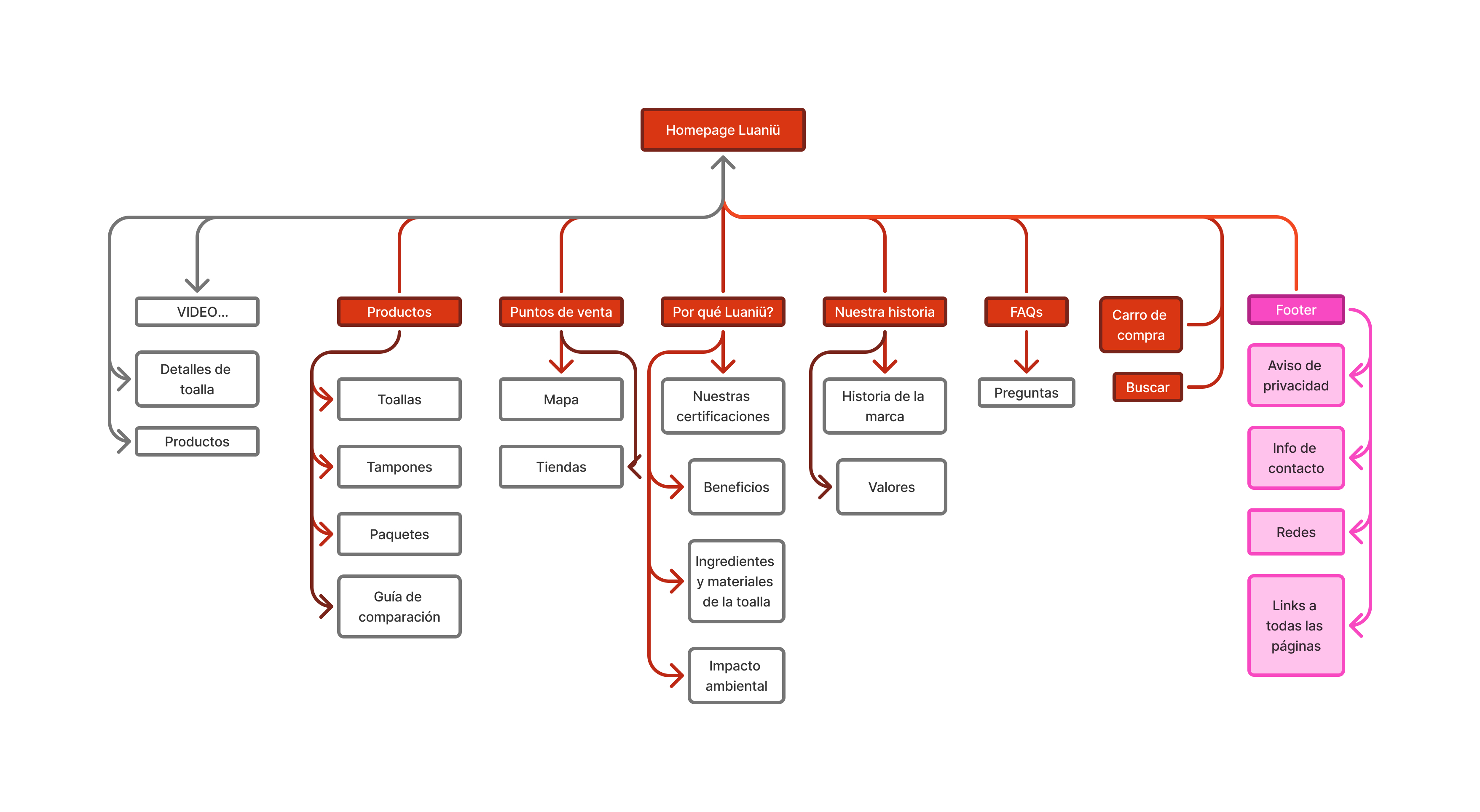
Information Architecture
Mapped user journey, simplified navigation, and prioritized sales-critical pages
Wireframing
Developed low-fi wireframes to rapidly iterate on layout concepts and structure
UI Design & Prototyping
Created high-fidelity designs maintaining brand identity while improving usability
Key Design Solutions
The redesign focused on three core principles: clear information delivery, smooth user flow, and preserved brand identity.
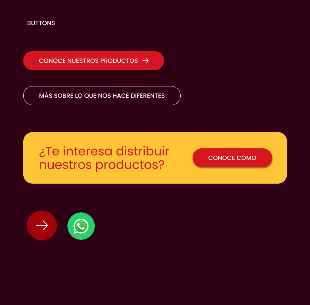
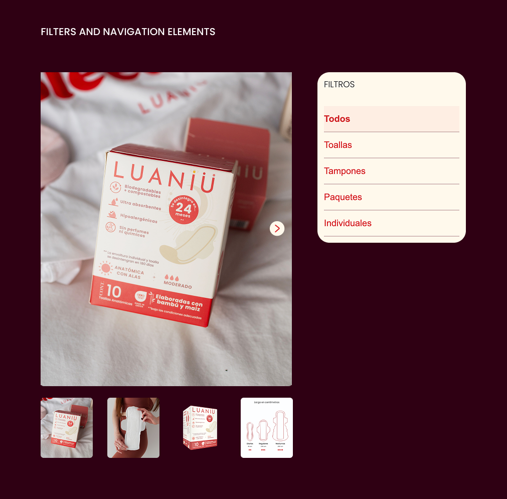
- Streamlined Navigation: Reduced menu items and created intuitive site hierarchy
- Strategic CTAs: Placed prominent, action-oriented buttons throughout the user journey
- Brand Consistency: Used red and beige color palette consistently while improving contrast
- Clear Value Proposition: Communicated eco-friendly benefits and product quality upfront
UI Components & Visual System

✨ Final Design
The completed website is fully responsive, accessible, and maintains Luaniü's magical feminine aesthetic while dramatically improving usability and conversion potential.
Visit the Website →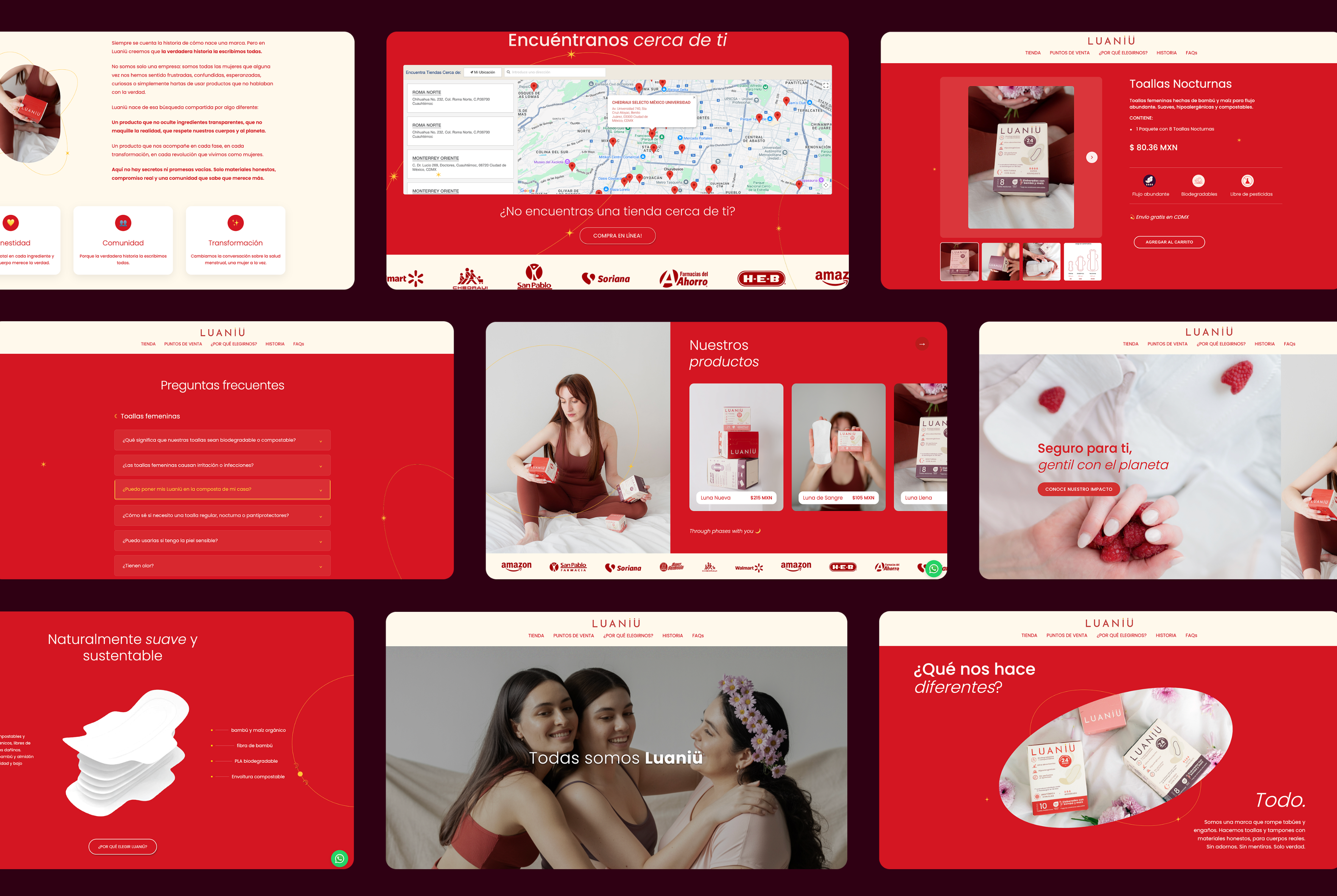
✨ Conclusions and Lessons Learned
Limitations
This project reminded me that not every proposal will be accepted, sometimes clients choose to go in a different direction, even if it compromises aesthetics or usability. As a designer, learning to adapt while maintaining professional integrity is part of the process.
What I Learned
Working independently on this project meant taking full responsibility for every detail, from design to implementation. I learned to: Solve problems on my own and find efficient ways to bring each element to life without a support team; Stay organized, since managing all design and development files by myself required a clear, structured workflow to avoid errors and ensure consistency.
What I Would Do Differently
If I could revisit this project, I would: Communicate more assertively with the client, explaining more clearly the long-term impact of design and UX decisions to support better outcomes; Optimize the media loading experience, perhaps by integrating a “page loader” or preloading system, to make the page feel smoother and more dynamic during initial load times.