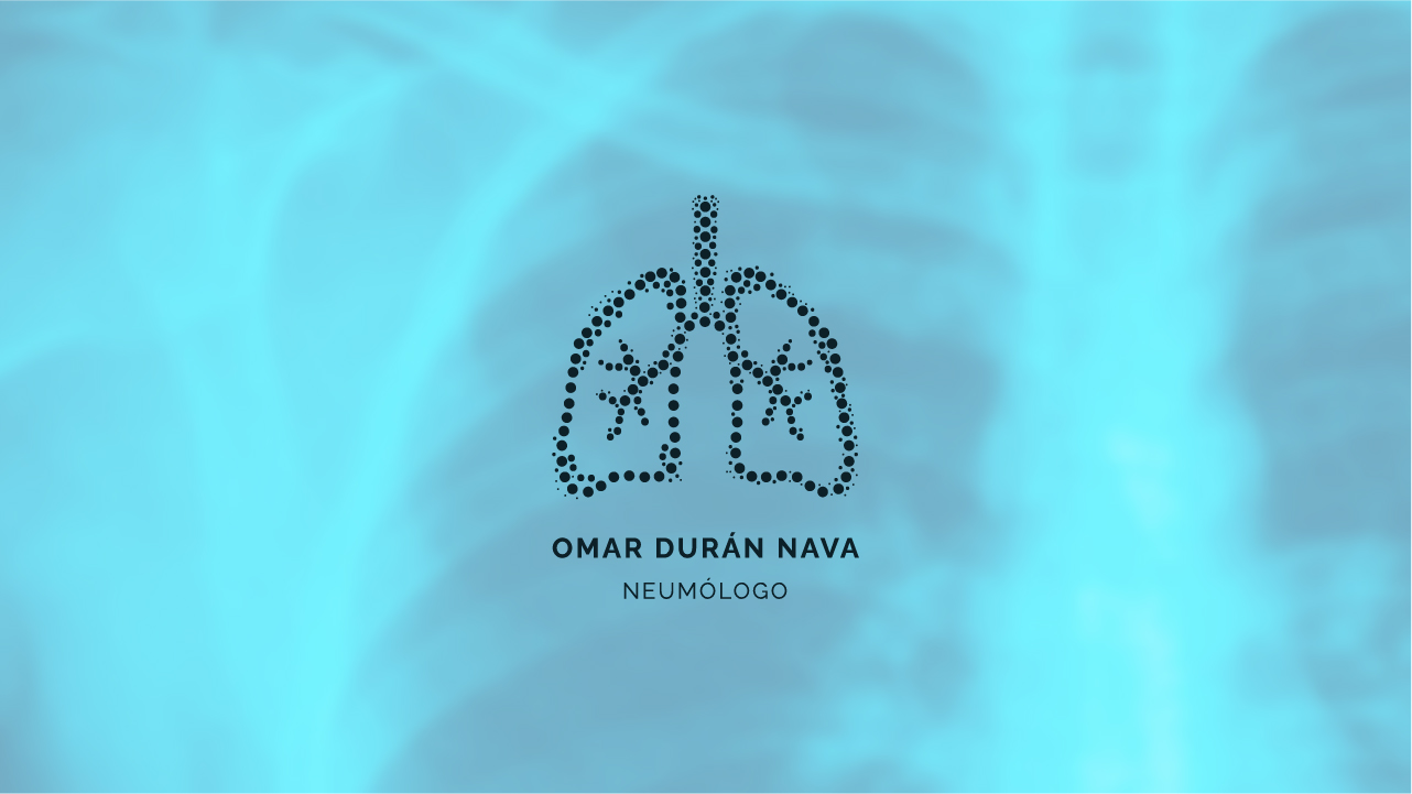
Branding for Dr. Omar Durán
Comprehensive branding for a pulmonologist's practice, including logo design, print materials, and interior design guidance.
Role
Brand Designer, Visual Identity Designer
Deliverables
Logo, Brand Guidelines, Print Materials
Client
Medical Practice
Industry
Healthcare / Pulmonology
👩🏻💻 Overview
Dr. Durán is a pulmonologist who needed a comprehensive brand identity to establish his medical practice.
This project involved developing a complete visual identity system, from logo design to print materials and office environment consultation, ensuring every touchpoint reflected the practice's commitment to health and patient wellbeing.
🧩 Challenges
The main challenges for this medical branding project were:
- Patient comfort: While professional, the identity couldn't feel cold or intimidating to patients seeking care.
- Specialty focus: The design had to clearly reference pulmonology without being too conventional.
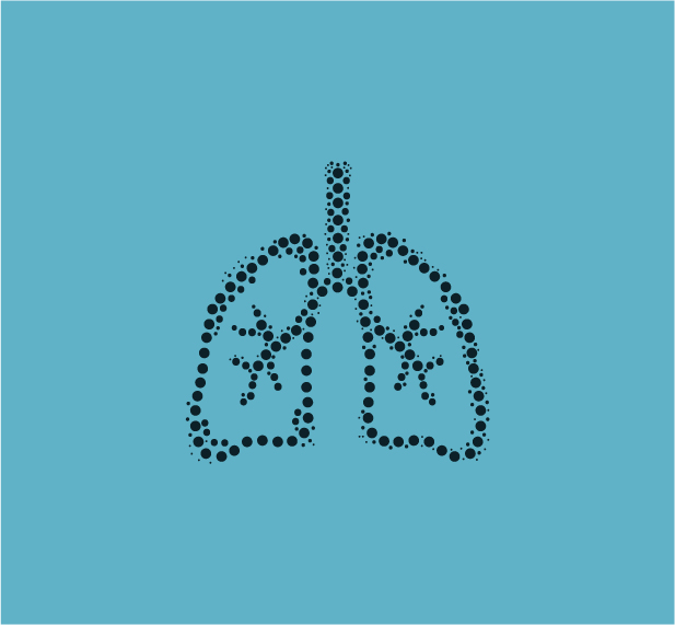
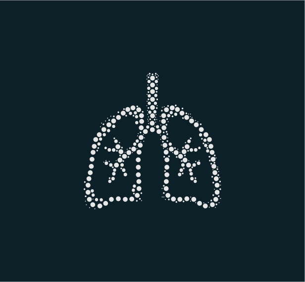
✏️ Logo Design
The logo design features a stylized representation of lungs created with a dotted pattern, symbolizing both the pulmonology specialty and the idea of breath and airflow. The minimalist approach ensures versatility across various applications while the dotted pattern adds a modern, approachable touch to what could otherwise be a clinical symbol.
Design Philosophy:
- Breath & Life: The dotted lung pattern represents the flow of air and the essence of breathing
- Modern Medicine: Clean lines and contemporary typography reflect advanced medical care
- Human Connection: The organic, flowing shapes maintain warmth and approachability
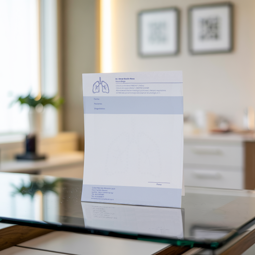
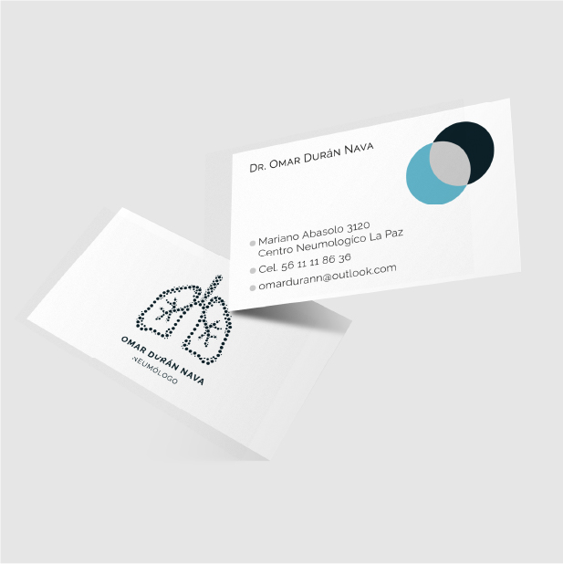
✏️ Brand Applications
The brand identity was carefully applied to various printed materials essential for the medical practice. Each application maintains brand consistency while serving its specific functional purpose, from formal correspondence to daily prescription needs.
Print Materials
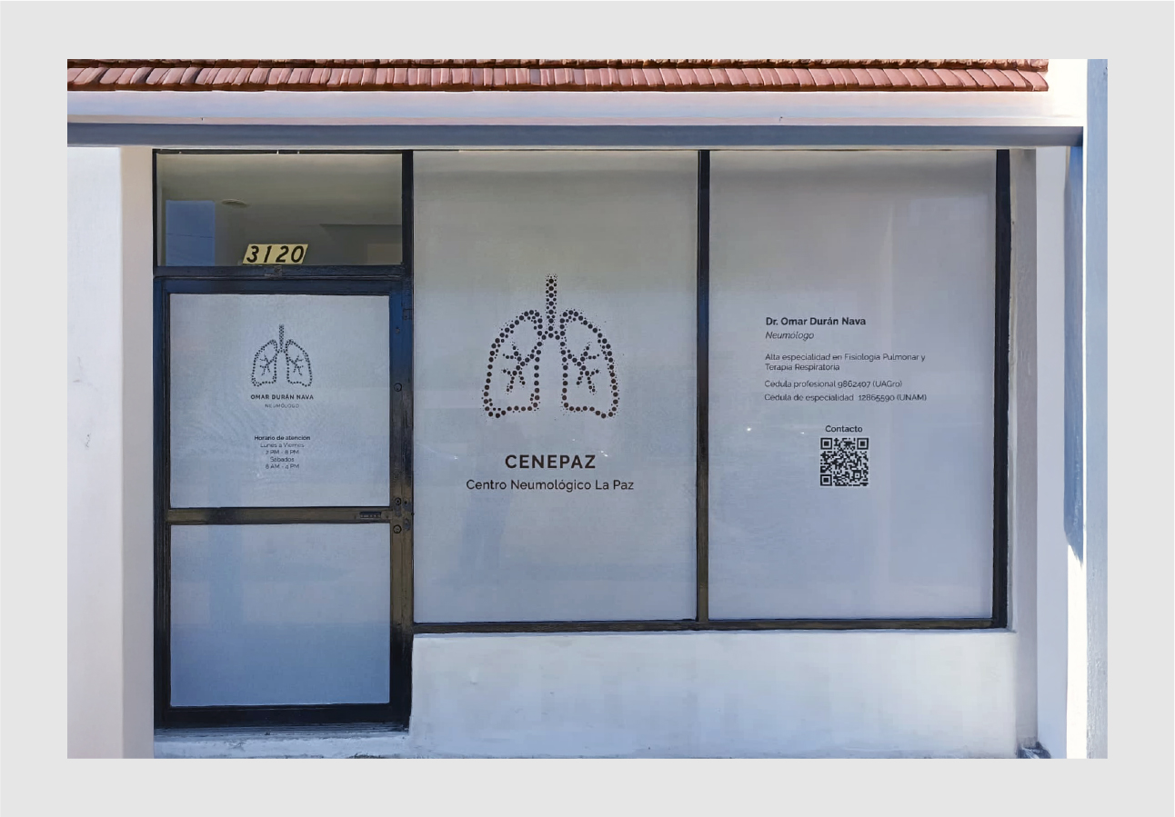
✏️ Office Environment
Extended the brand identity into both the interior and exterior of Dr. Durán’s medical practice. On the exterior, I created visual elements that make the clinic immediately identifiable to passersby while reinforcing the connection with the doctor. These visuals incorporate a QR code that links directly to the doctor’s Linktree, offering quick access to essential information such as professional license details and consultation hours.
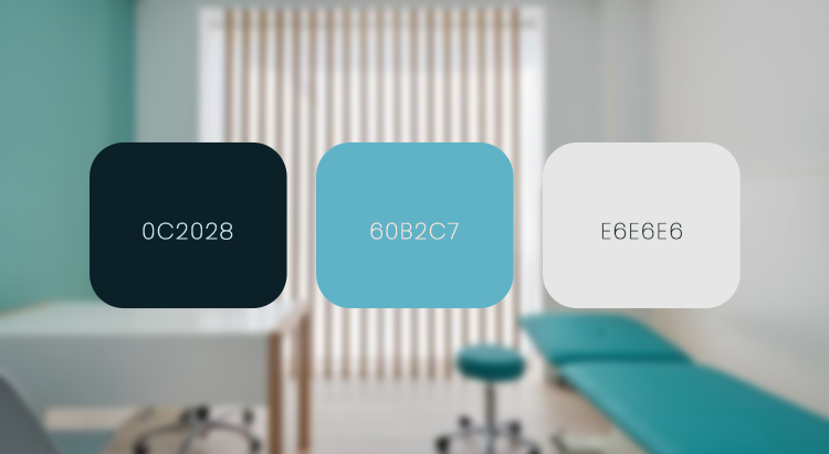
🎨 Color Palette
The color palette centers around calming blue tones, symbolizing air, cleanliness, and trust, all important attributes for a pulmonologist's practice. Complementary dark blue and light grey provide contrast and versatility across different applications.
The hues were also inspired by the visual language of radiography, subtly echoing the shades typically seen in lung X-rays, further grounding the design in the medical field it represents while maintaining an approachable and professional appearance.
Key Outcomes:
- Enhanced credibility: Professional brand presence increased patient confidence and referral trust
- Clear differentiation: Unique visual identity set the practice apart from competitors
- Consistent experience: Cohesive branding across all touchpoints reinforced quality perception
✨ Reflections & Lessons Learned
This project reinforced the importance of understanding both the functional and emotional needs of healthcare branding. Balancing medical authority with patient comfort required careful consideration of every design element, from color psychology to symbol interpretation.
Working within the constraints of medical practice regulations while creating something distinctive and memorable was both challenging and rewarding, ultimately resulting in a brand that serves both the doctor's professional needs and his patients' trust.